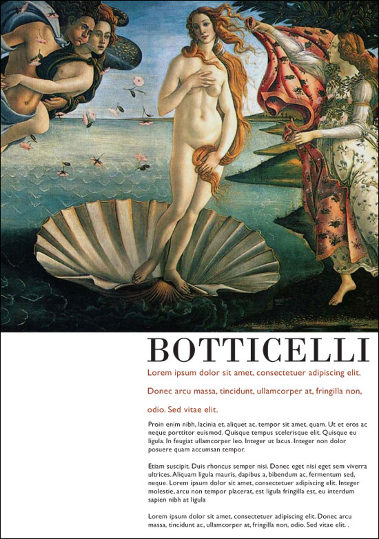
Page Layout Wk 04: Golden Mean Layout Pt 2, Typography
Please note: These notes are specific to the PC’s in the classroom this subject is taught in. It’s not meant to be read as absolute rules. There are plenty more appropriate fonts on other PC and apple computers.
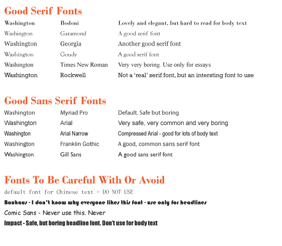
Some general guidelines on using text
Body text
Body text must be read – do not try ‘designing’ with it.
Keep body text between 8 – 12 points.
Don’t make the body text line-length too short, or too long.
Sans serif is a safe body text.
Headline text
Don’t stretch.
Sans serif is a safe headline font.
'Kerning' or letter-spacing headline text can be attractive.
This week’s assignment:
2 Layouts using a golden mean, and typography.
Create another two Layout using the golden mean. One layout using 1-2 images, the other layout 2-3 images.
Use 2 font faces for your typography – one serif, one sans serif.
In one layout, use a serif for headline.
In your second layout, use a sans serif for headline.
Please print your two layouts on one A3 for next week.